Happy Friday!
It’s been an exciting week as we kicked off our Sports Equinox Broadcast Time Spent Series (trademark pending). For this, we’re doing primary research 🔬 to find out just how much of a sports broadcast is actual gameplay.
You may have already seen two of these - hockey and football - but the goal is to get all 4 major sports leagues done before the actual sports equinox ☀️ on October 28th. Then we’ll make one full breakdown to rule them all.
Anyways. Today’s newsletter explores the NFL-specific broadcast breakdown 🏈⏱️
Vision 👁️
When it comes to TV ratings, the NFL reigns supreme. 👑
Sunday Night Football pulls in over 20 million viewers each week—more than twice the audience of last year's NBA Finals. The Super Bowl last year attracted 123 million viewers, nearly matching the audience of the first moon landing… 🌕
But have you ever stopped to think about what you’re really watching?
Sure, there are commercials and stoppages, but just how much of the broadcast do they take up? This analysis gives you a second-by-second breakdown of exactly what unfolds on your screen every weekend.
CHARTS 🌁
Earn Your Stripes 🐯
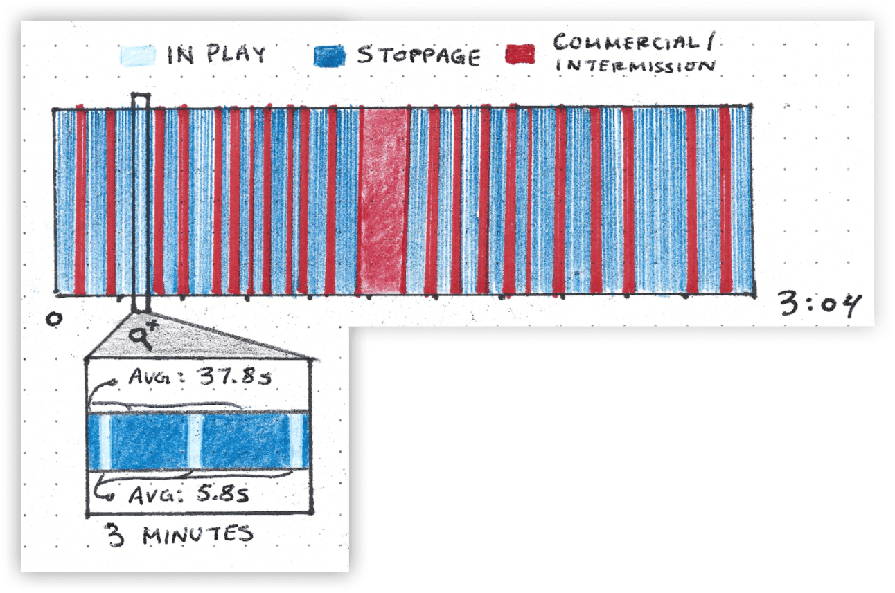
Chart Type - Categorical Heatmap 🔥
From the moment we chose this topic, we knew this chart would be the key. The overwhelming sea of dark blue and red tells you everything you need to know about the composition of a broadcast.
To measure the game time, we built a timer tool with toggles for each type of play. It looks like this. ⬇️ Also linking it here if anyone wants to do this themselves.
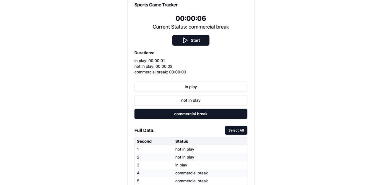
By the end of the game, we had almost 11,000 data points—one for every second, categorized by status. The average NFL play unfolds like this:
🏈 Run the play (~5 seconds)
🗣️ Broadcaster discusses the play (~10 seconds)
🔄 Replay shown (~20 seconds)
🚶 Getting ready for the next play (~10 seconds)
As we reviewed every second, we began to notice how regimented the game really is. While there’s plenty of downtime, the structural flow made the whole experience feel scientifically engaging. 🧑🔬
As the experiment went on, I started to feel like a lab rat 🐀. The way the broadcast effortlessly switched tones and nailed every timing mark had me hooked from start to finish. It made me realize just how tightly we’re locked into their rhythm.
How we rate it ✭✭✭✩✩
Leaving a bad review on this chart stings, especially since I’ve been thinking about it since the moment this data came to mind. I mean, drawing 400 lines by hand has to count for something, right? ✍️
For comparison, here’s how the computer-generated version.

I did my best to replicate it, but the lines were so tiny that my hand-drawn version turned into a bit of a mess. I didn’t even have pencils thin enough to mark the 5-second intervals, so I used negative space to represent them instead.
Sure, it still conveyed the story well, but the visual wasn’t as sharp—so we’re docking two stars.

Mountain Range 🏔️
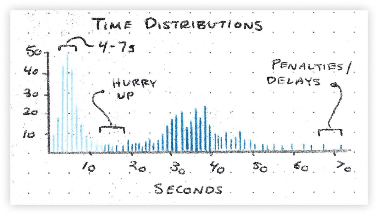
Chart Type - Double Histogram 👯
A rare opportunity to use a histogram properly.
We wanted to show the distributions of play durations on the same plane as stoppage durations. Each play is fairly short (4-7 seconds) and doesn’t have too much variability; even an 80-yard run 🏃 is at most 12 seconds long. But that’s not the case for stoppages.
While there is of course a play clock of 40 seconds ⏱️, so many factors can extend the time between plays. Moving the chains for a first down, flags, injuries, you name it.
In fact, 26% of all time between plays were more than 40 seconds.
How we rate it ✭✭✭✭✩
This chart was well-intentioned and served proper statistics 📊 for once.
When visualizing distributions there aren’t a ton of options with out-of-the-box graphs so this was an easy choice. I especially liked comparing distributions on the same chart. Since every play in football is paired with a stoppage, it’s cool to see how they align.
The only issue was my choice of colors. Using two shades of blue didn’t go over well—at least according to TikTok. 📲


It’s Not a Pie Chart I Swear 🥧
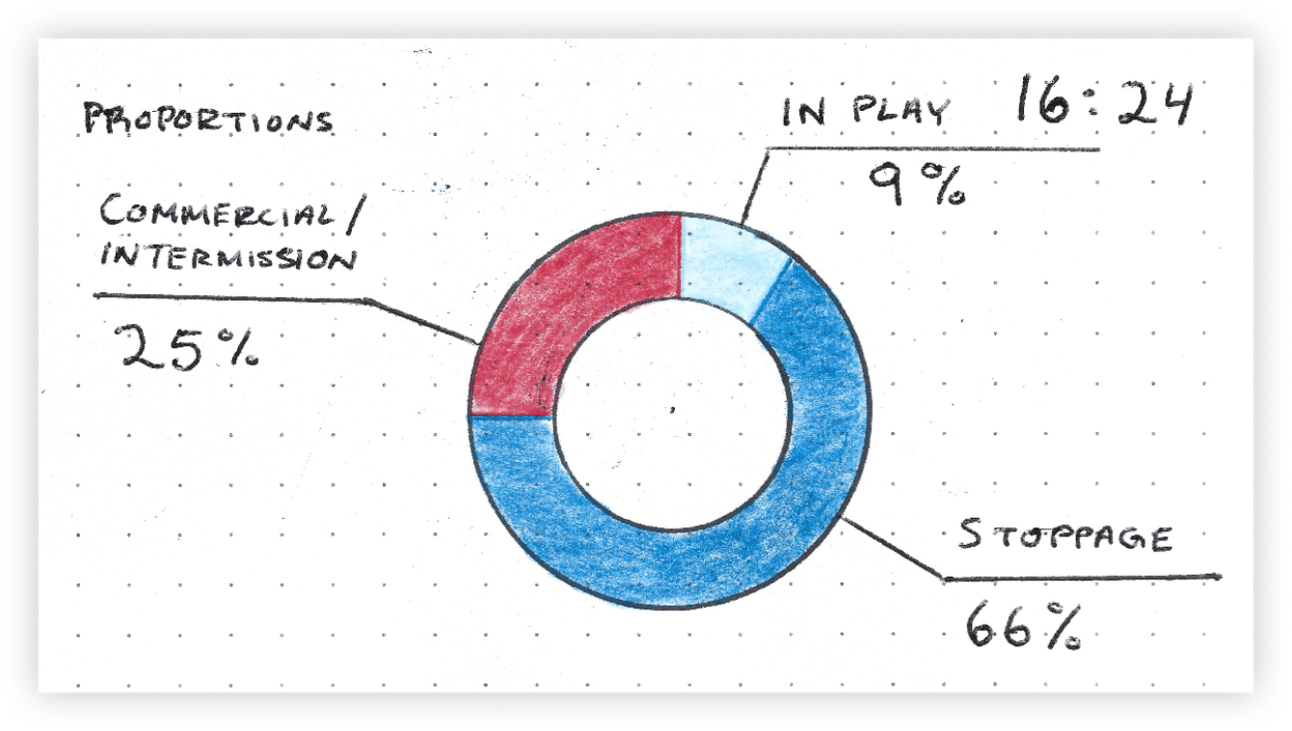
Chart Type - Donut 🍩
The premier dessert-inspired 🎂 graph has arrived. In my opinion, every pie chart should be a donut chart. Donuts are sleek, professional, grown up, and elevated 🎩. Pie charts are elementary, simple, boring, and uninspiring 🧢. Avoid at all costs.
That said, this part of the breakdown was the mic-drop moment. It’s where all the granular data converges into the aggregate metrics we see here. From a storytelling perspective, this approach was really enjoyable.
😈 Tease the finale at the start.
🔢 Dive deep into the weeds of the data.
💣 Wrap up with the big metric everyone’s been waiting for.
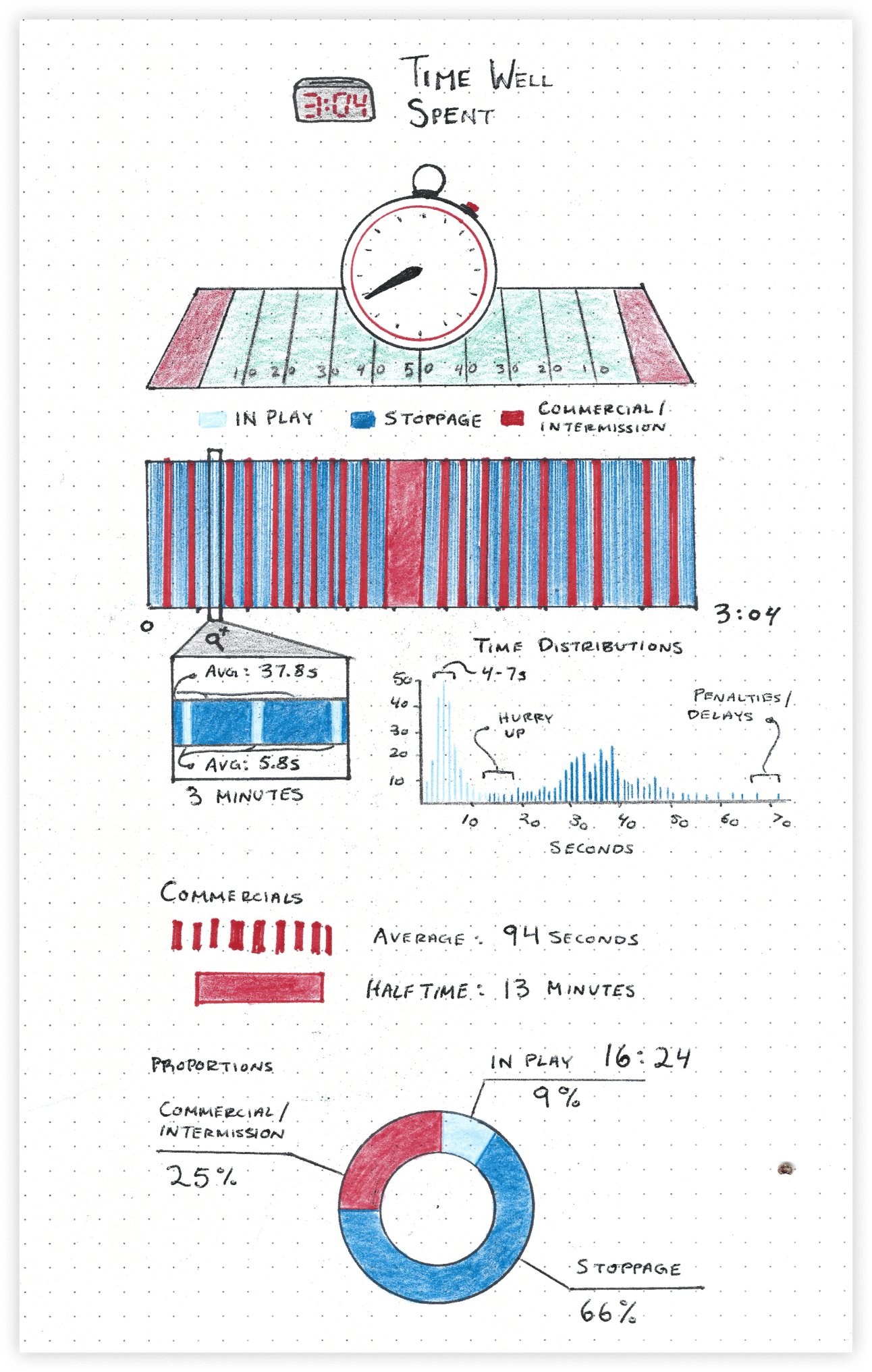
And the metric itself was wild… Of a 3+ hour broadcast, 16 minutes were spent playing football, just 9% of the broadcast. 🤯
How we rate it ✭✭✭✭✭
The beauty here lies in its simplicity. You don't need to study this chart to understand what's happening—its low barrier to entry makes it an effective graphic.
When working with proportional data, it can be challenging to get too creative. We’ve tried stacked bars, dot plots, and other options, but visual boundaries are essential to represent the 100% totals accurately.
If anyone has suggestions for better proportion charts, I’d love to hear them!
OTHER STUFF WE MADE 🎥
How much hockey are you actually watching?? 🏒📺
Unrivaled Basketball Club launch 🏀🚀
Thanks for reading and please feel free to reach out with any feedback! Love it or hate it we’re all ears 👍
— Claire and Riley

