Happy Friday!
Our favorite video breakdown this week was actually for a client—Duke Women’s Basketball.
The project was created to celebrate the team’s 50th anniversary in 2025, highlighting the storied history of the program. It also happens to be our 50th newsletter anniversary - what are the odds?
This project turned out to be the most creative data visualization we’ve ever produced and worthy of a breakdown. Let’s get into it ⬇️
Vision 👁️
To celebrate Duke Women’s Basketball’s 50th anniversary, we were tasked with transforming a vast collection of raw statistics into a cohesive narrative that highlights the program’s ups and downs over the past five decades.
But there was so much data to choose from… 😵💫
Individual accolades, team awards, new stadiums, coaching changes—everything. As with any sport, the challenge isn’t finding statistics but streamlining the content to ensure efficiency while still telling a compelling story. 📚
CHARTS 🌁
When the Bones Are Good 🔵

Chart Type - Dot Plot Timeline 🔗
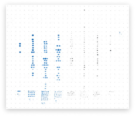
You’re looking at the Sharpie bleed ✍️ on the back of the paper, which shows exactly how the dots are laid out without the lines.
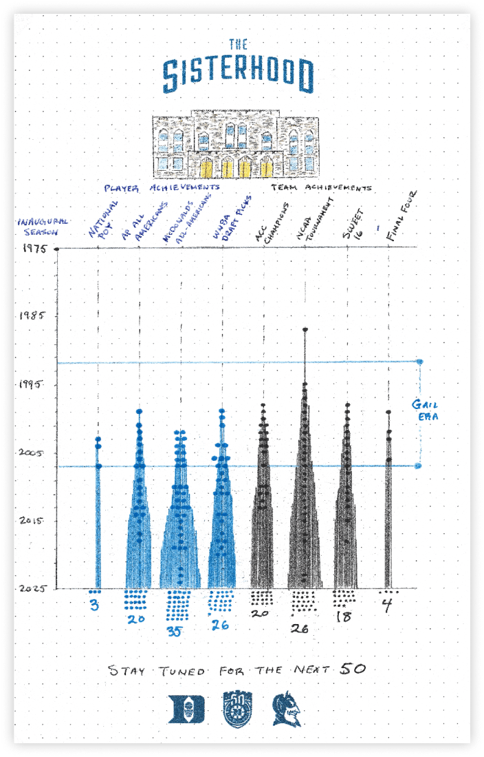
Every year since 1975, we marked an achievement with a dot. 🔵 Simple, right? A dot means it happened—no dot means it didn’t.
We narrowed the statistics into eight categories - divided into individual accolades and team awards - and plotted them on a vertical timeline.
Individual Awards
National Players of the Year
AP All Americans
McDonald’s All Americans
WNBA Draft Picks
Team Awards
ACC Championships
NCAA Tournamants
Sweet 16s
Final Fours
The overarching vision of the project was to showcase the cumulative success of the program, so we added a “collection zone” of dots at the bottom that adds them all up. 🧮
That zone is particularly effective when watching the video in real-time, as it reinforces the message by tallying the awards both verbally and visually.
How we rate it ✭✭✭✩✩
By itself, this chart would be pretty dull—just a bunch of dots in vertical lines... gross.
But where it shines is in showcasing Duke’s periods of success. Even if you squint, you can spot where the “action” starts to happen, which leads perfectly into phase 2️⃣ of the graphic.

Tree of Success 🌲

Chart Type - Spire Chart ⛪️ (Riley I)
Innovation alert 🚨
I haven’t personally seen this type of chart before, which means we might have the chance to name it. We could go the Simone Biles route and call it the Riley I, or choose something more generic like Spire Chart, since it’s giving church spires ⛪️.
Here’s how it works:
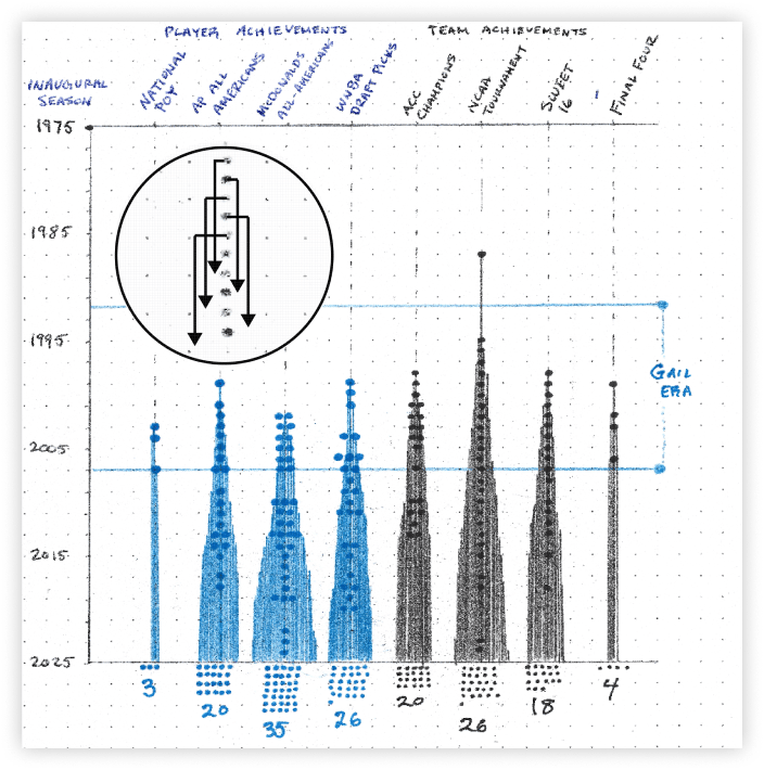
For each dot on the plot, we drew a line l starting from that point and extending down to the present axis with each new line placed outside the previous ones, causing the base to widen. The zoomed graphic 🔎 above shows how it works in practice.
So, for categories like WNBA draft picks, where Duke Basketball has more awards, the base expands accordingly and gives an effective sense of breadth even at first glance.
How we rate it ✭✭✭✭✭
Just think about the alternative for a moment.
Normally, a “history of the program” graphic would just be numbers on a page—20 ACC titles, 18 Sweet 16s, etc. 🥱
This chart does so much more to visualize what it really means to build a dynasty. In the beginning, the space is empty, but as successes accumulate, no one can take them away.
Cumulative achievement is often overlooked in favor of recent wins, and it’s time we give it the recognition it deserves with proper data visualization. 📈
OTHER STUFF WE MADE 🎥
A few fun breakdowns and partnerships with some big names in sports this week. The NFL and NBA both collaborated on a post which was an awesome boost and it was so fun to work with those leagues, check them out below!
NFL London games - tube map visualization 🗺️

Fantasy basketball breakdown - Yahoo and NBA partners post 🏀🔢

How the Oakland Athletics turned their back on fans ⚾️🏟️

What MLB teams spend on their players 📈⚾️
Thanks for reading and please feel free to reach back out with any feedback! Love it or hate it we’re all ears 👍
— Claire and Riley


