Welcome to the new SportsBall newsletter format - where you get a peek inside the brain of a caffeine-addicted amateur data visualization artist. 🧠
Each week we’re hosting a deep dive into our favorite breakdown of the week, explaining our thought process while also giving honest self-feedback. If you like graphs or colored pencils, you’re in the right place. 📍
Vision 👁️
The Tour Championship has the largest payout in the PGA, but so few people know about it. Our goal was to use the tournament as a trojan horse topic 🐴 to discuss money in golf and touch on Scottie Scheffler’s dominance.
CHARTS 🌁
Prize Money 💰

Chart Type - Bar chart with a twist 🔀
There are 38 tournaments that make up the golf season and the goal was only to compare cash prize values of each. 💰 We removed the timeline variable and positioned each tournament right after one another.
We also utilized axis manipulation to emphasize how significant the prize money was for the Tour Championship. The x-axis only extended to $40 million until we added on the $100 million tournament.
This is a fantastic method of emphasizing the outlier value, especially in video format. 🎥
How we rate it ✭✭✭✭✩
This was an almost perfect use case for this type of chart. It handled the vertical layout phenomenally and since 38 bars is a ton, positioning it this way was elegant 💃 - if I do say so myself.

Golfer Earnings 💰

Chart Type - Beeswarm 🐝
One of my very favorite graphs to use, but only if the data is right!
The goal was to emphasize Scottie Scheffler’s dominance this past year as he earned ~50X more than the median golfer. 🤯
When the dots are spread out like this, the reader easily understands where the significant mass lies, helping outlier data points like Scottie pop even more. 💥
How we rate it ✭✭✭✭✭
This graph is ripe for annotation.
Circling individuals, overlaying median values, or introducing benchmarks is very easy and it doesn’t muddy the waters too much. 🔎
We loved it!

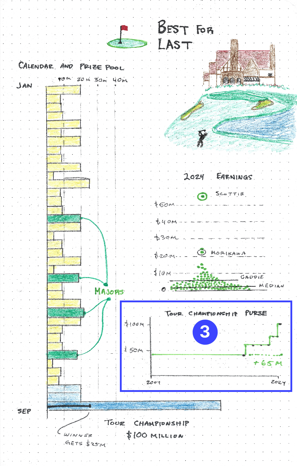
Tour Championship Purse 👜

Chart Type - Line with steps 🪜
Line charts are always an option when dealing with time series data.
But they can be boring. 😴
We needed to simply show the increase in prize money for this single tournament and the long stretch of no change followed by the quick step-ups did the trick.
How we rate it ✭✭✩✩✩
This felt lazy and lackluster, even drawing it had me yawning. 🥱
OTHER STUFF WE MADE 🎥
A few fun breakdowns and partnerships this week, check them out below on Instagram!
Thanks for reading and please feel free to reach back out with any feedback! Love it or hate it we’re all ears 👍
— Claire and Riley


