Happy Friday, I hope everyone had a fantastic Halloween!
In case you missed it, this week marked the Sports Equinox on October 28th, and we wrapped up our Equinox Broadcast Game Time analysis 🤓 with some intriguing insights from our 4-sport comparison.
Our big finale was a detailed breakdown between sports, where we ventured into a bit of "sports theory" and shared our picks on which games we enjoyed the most. ⬇️
Vision 👁️
When we started SportsBall, one of the biggest challenges was sitting down to watch full games with Claire. She wanted to get familiar with not only the rules of each sport but also the flow and strategies involved. ♟️
But here’s the thing: it wasn’t easy. Early on, Claire noticed just how much downtime there is in sports, especially football—almost a full minute between plays, plus commercials popping up constantly. 📺 That got us wondering: “Which sport is the easiest for a casual viewer to sit down and actually enjoy?”
So here we are.
We categorized every second of gameplay in each of the four major American sports to finally get some perspective on that very question. Understanding how much actual game footage takes up each broadcast was enlightening 💡 and brings an interesting perspective on “sports theory”.
CHARTS 🌁
Earn Your Stripes 🐯

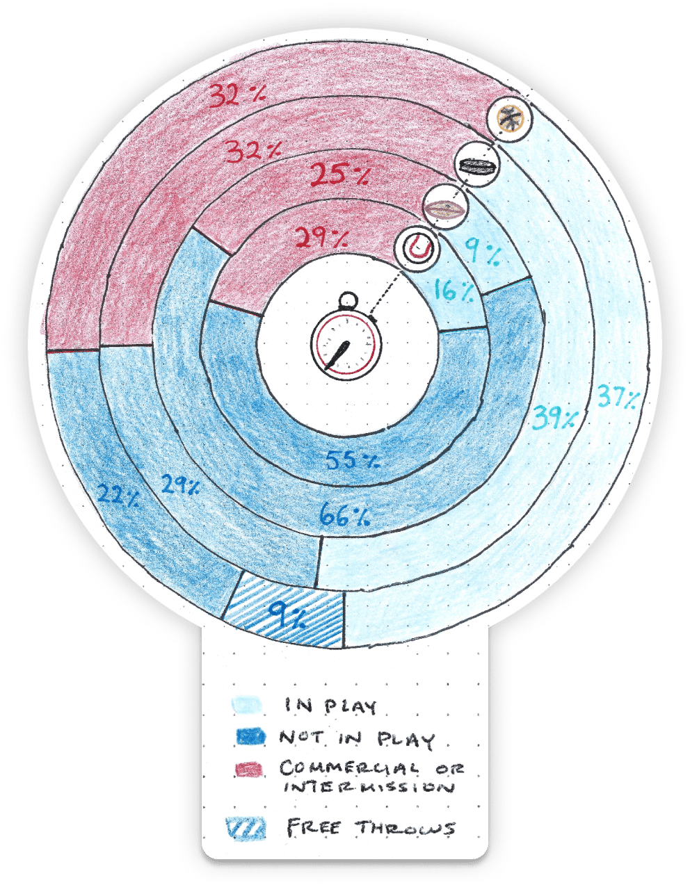
Chart Type - Stacked Ring Bar Chart 🪐
This project was a grind.
I’m not sure the last time I sat and watched a full sports game, no phone, no standing up for commercials, no chatting. Just pure research 🔬 for the greater good.
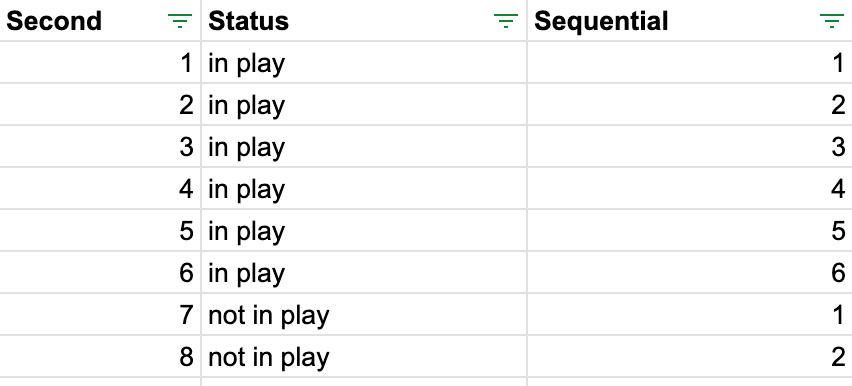
As I jammed my buttons for each category, the data came out looking like this - just with 10,000 more rows.

The key to prepping this data was making sure all sports were represented in the same way. We simplified it into three categories: in-play, out-of-play, and commercial time (plus free throws for basketball).
Some of our TikTok commenters didn’t love these categorizations, but the simplicity was designed for casual fans—not necessarily for someone keeping their own scorecard at a baseball game. 📋

With the final data in hand, the next decision was to choose the right type of chart. 📊
We had some limitations: multi-series proportional data can only be represented in a few ways. Traditionally, a stacked bar chart is the go-to option—we even created one above for the data visualization purists out there. ⬆️
But I use those a lot already, so I wanted to change it up.
While the stacked bar chart is certainly cleaner, more representative, and generally more presentable, switching to stacked rings felt like the right move.

Me choosing the proper charts for a visualization
How we rate it ✭✭✩✩✩
There are a few reasons we don’t love this one, partially mentioned above.
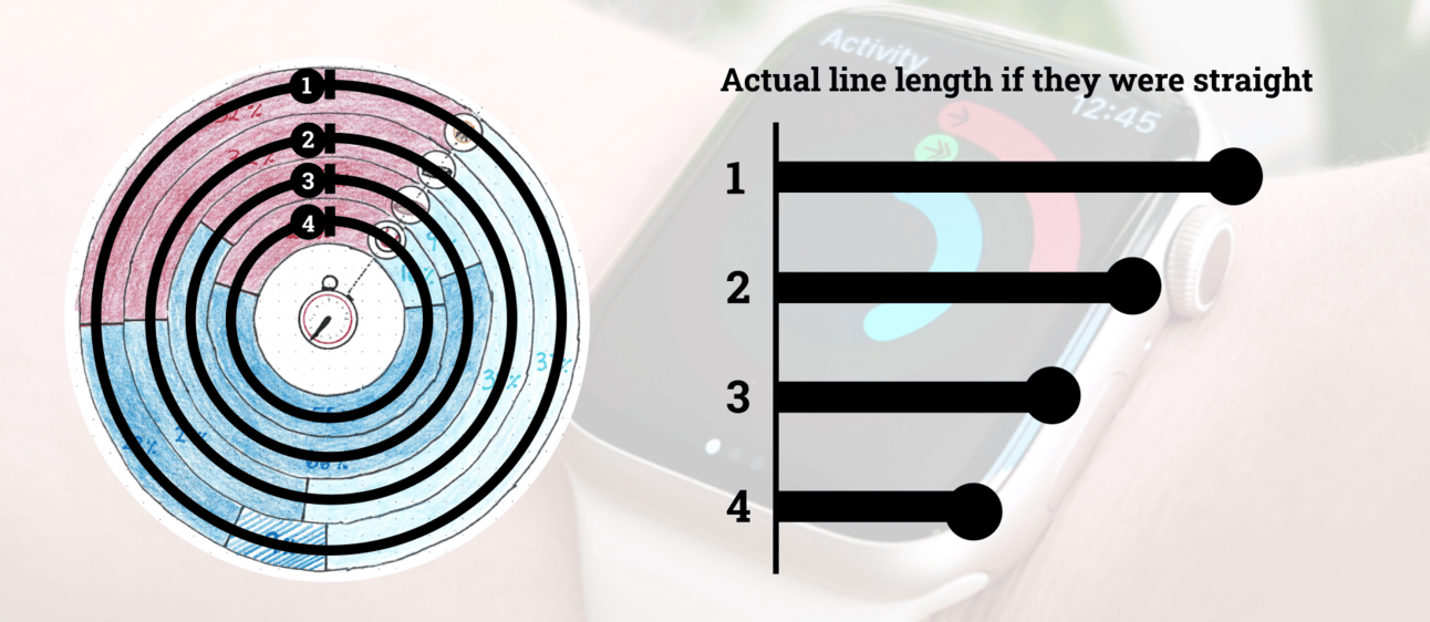
At its core, the chart visually misrepresents data. As this response points out, the outer rings occupy more space on the page, which can subconsciously lead readers to place more importance on them. 🧠

It becomes an issue especially when we’re working with a big radius and in this case, the basketball 🏀 ring is more than double the length of the baseball ⚾️ ring.
Here’s that concept visualized if we straightened those rings out. It’s the same problem you get with the Apple Watch fitness rings.

Is it a big deal for my doodle videos ✍️ explaining sports? Not really.
Is it a bad practice in general? 🙅 You bet.

Double Dutch ‼️

Chart Type - Timeline and Area Timeline ⏱️
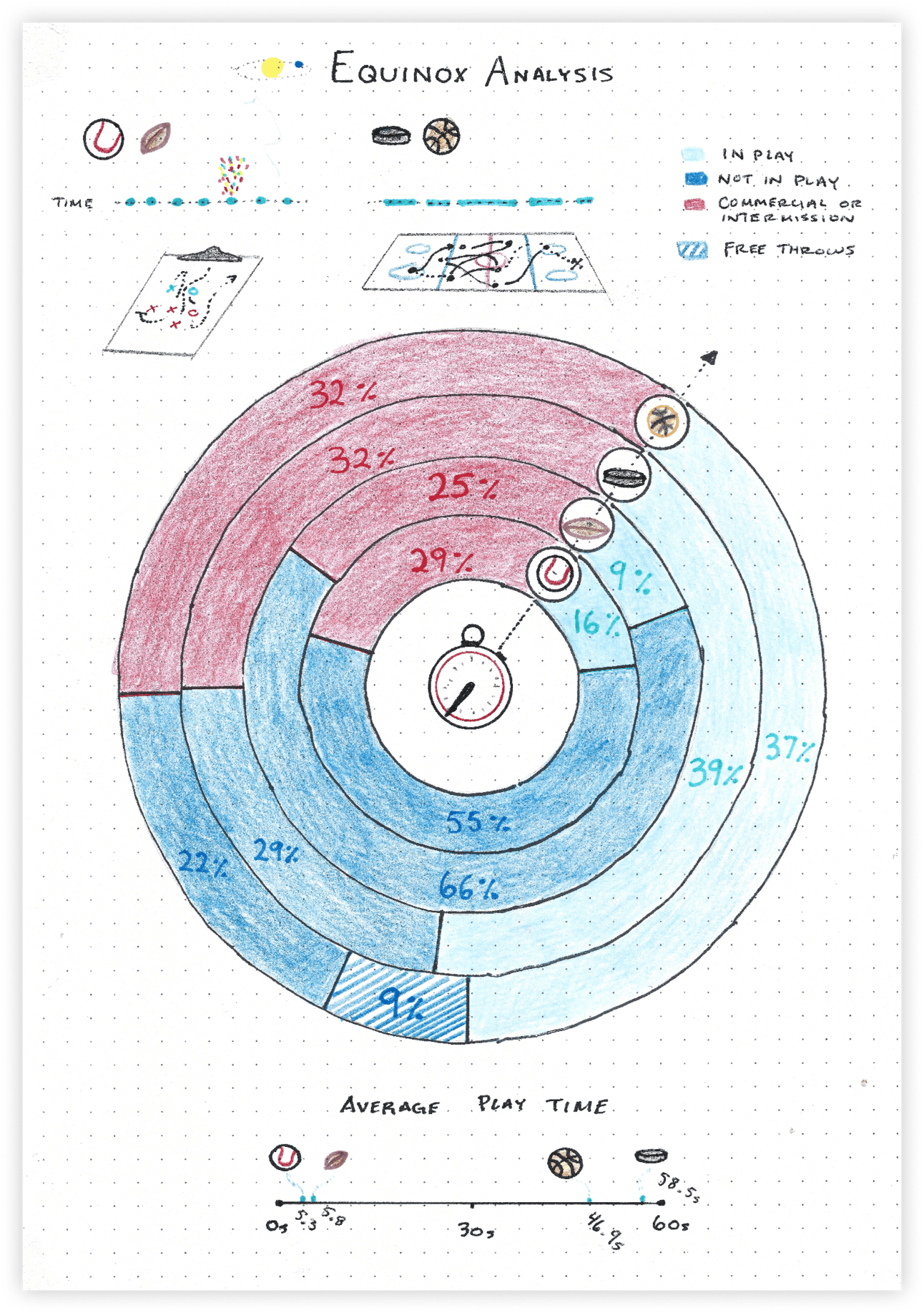
The core of this breakdown was the ring chart, but that doesn’t mean we can’t have some fun in the margins.
As we worked through this analysis, a clear division between the two groups of sports emerged.
Conceptually, baseball ⚾️ and football 🏈 are what we’d call “distinct event sports.” They’re marked by short, highlight-ready plays 🎉 that can stand alone in the media, making them more similar than you might expect. The average play only lasts around 5 seconds in these sports, with long breaks in between—but that’s not necessarily a drawback.
Both sports are highly strategic and rely heavily on individual matchups, like the pitcher versus batter in baseball. This means the time between plays is where teams strategize, aiming to beat their opponents mentally. ♟️

Hockey 🏒 and basketball 🏀, on the other hand, follow a different rhythm.
These sports don’t have mandatory stoppages, allowing for minutes of continuous action. I like to think of these as “flow games,” where you need to watch for extended periods 🧘 to fully experience the movement and rhythm of the game.
How we rate it ✭✭✭✭✩
These charts made great supporting actors. They weren’t the stars of the show, but they played their parts nicely.
The Average Play Time chart captures the idea of paired sports well, showing how basketball and hockey closely align, while baseball and football follow a similar pattern.
The next chart gives insight into game flow—on the left, you see the distinct moments, and on the right, the extended periods of continuous action.
Both charts complement the core ring chart and add new insights beyond just proportional time spent. They’re the Robin to our ring chart’s Batman.
OTHER STUFF WE MADE 🎥
All 4 Sports of our Equinox Series ☀️🌎📺

MLS Season in Review and Playoff Preview ⚽️🏆
Thanks for reading and please feel free to reach out with any feedback! Love it or hate it we’re all ears 👍
— Claire and Riley


