Happy Friday and welcome to everyone new here!
The SportsBall newsletter is simple.
We take our favorite analysis of the week and go behind the scenes on the data visualizations and storytelling process. Today’s breakdown du jour is a piece we’ve wanted to do for a long time - how pro sports leagues make their money. ⬇️
Vision 👁️
If you or someone you know is a sports fan, understanding how leagues generate revenue 💸 is foundational knowledge.
People often forget that, behind the athletes and games, there’s a business. And the more you can visualize the business, the easier it is to understand concepts like salary caps, ticket prices, TV blackouts, and players’ unions. 🤔
And every league is unique.
Our goal with this breakdown was to simplify the data into one core chart, using it as the anchor ⚓️ for the whole discussion and strip away the distractions to give a 30,000-foot view 🛩️ of the bigger picture.
CHARTS 🌁
Level the Playing Field ⚖️

Chart Type - Stacked Percentage Bar Chart 🥞
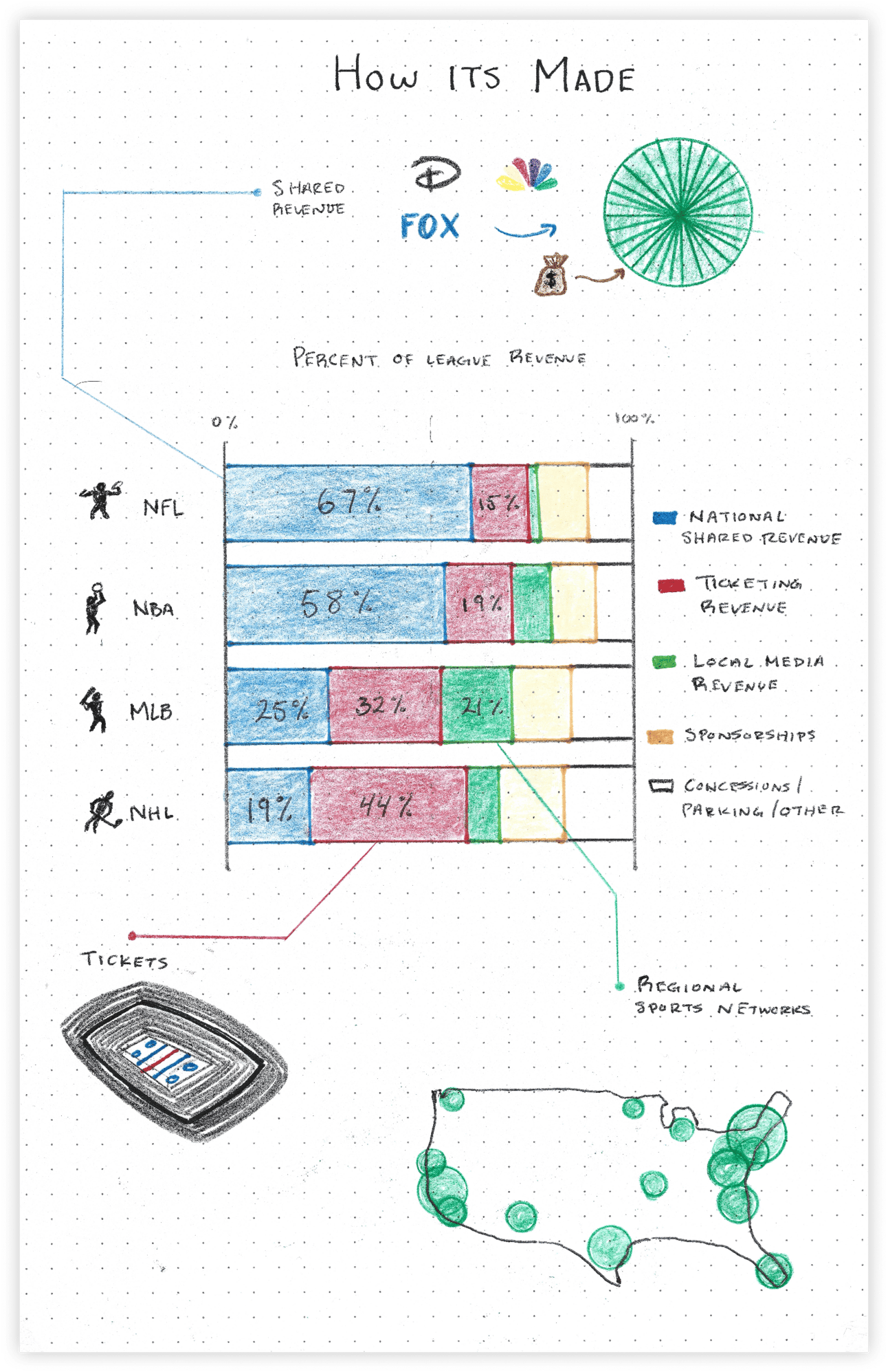
The first thing to know is that each league makes a very different amount of money. Here are the 2023 estimated raw revenues for the top four leagues:
🏈 NFL: $20B
🏀 NBA: $11B (jumping up to ~$15B this year)
⚾️ MLB: $11B
🏒 NHL: $6B
But that’s not the point.
What we cared about most was how these leagues make their money, not how much. If I were up in the high tower, making the big decisions, what would I focus on? That’s why we zeroed in on proportional revenue and landed on the stacked percentage bar chart.
This approach allowed us to make apples-to-apples 🍎 comaprisons, highlighting their reliance on different income streams.
For example, the NHL still makes most of its revenue from ticket sales. 🎟️ That means fluctuations in attendance can be tough for teams, and they need large enough stadiums to maximize capacity. The Arizona Coyotes (RIP), for instance, played their last two seasons in a 5,000-seat arena. Even though it was temporary, the team suffered financially. 🤒
Then you’ve got the NFL and NBA, both cashing in on huge national media deals that deliver a massive, fixed fee every year. This is that mouth-watering, recurring revenue most execs only dream about 🤤, and it’s a key reason why these two leagues will stay super healthy for a long time.
How we rate it ✭✭✭✭✭
This was a big “stay in your lane” moment.
It’s so easy to go down rabbit holes when talking about money in leagues but a chart like this strips out all other variables and focuses the conversation on the single topic we were discussing.
It’s a prime example of chart-insight alignment. When presenting data, your visuals need to be in sync with your message—otherwise, you get what I call “impact leakage,” and the audience tunes out.

Market Map 🗺️

Chart Type - Map Density Plot 🌎
I’m not usually a fan of map data visualizations.
Most of the time, they overwhelm you with too much data, and your eyes have to do way too much work. But before we dive into the inevitable map overload that comes with election season, I had to sneak this one in.
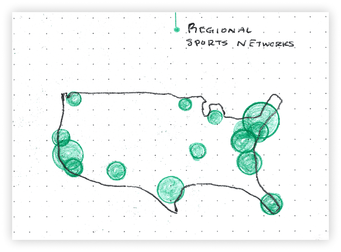
This map is all about showing the relative size of sports markets when it comes to regional media coverage—and for that, it hits the mark. 🎯
New York, LA, and Dallas pop off the page compared to the smaller Midwest markets. And that’s the point. The huge disparity between these markets is what makes big national media deals in sports like baseball and hockey such a headache. Teams like the Yankees and Dodgers have no interest 🙅 in splitting their cash with the rest of the league, and regional media deals let them keep it that way.
How we rate it ✭✭✭✩✩
I could have made this chart better.
Since it wasn’t driven by real data, I should’ve made the dots more varied in size to really show the differences. A little shading wouldn’t have hurt either—darker colors on the bigger dots would have made them pop.
With map data visualizations, less is more. We don’t need to see every little detail—county lines, rivers, even state borders most of the time. If the data points are obvious spots like LA, New York, and other major cities, you can strip it down, and the reader will still get the point without getting distracted.
And yeah, minus one star for me misplacing Milwaukee, as the IG comments so kindly pointed out. Geography is a work in progress. 🌎

Media Company Pie 🥧

Chart Type - Pie Chart 🥧
A true classic.
I imagine this is the reaction to us actually using a normal graph in our visualizations for once. ⬇️

To some people (Claire), every chart is a pie chart.
It’s so sturdy. So simple. So foundational to the data visualization community. Many say that pie charts walked so SportsBall could eventually run. 🏃
This chart, in particular, highlights how massive media companies pay billions to the NFL and NBA to broadcast games. The revenue is split evenly among the teams, so each NFL team gets a check for more than $400 million annually, even before selling a single ticket. That certainly helps the bottom line. 🤑
It’s also a huge shield 🛡️ for these leagues against unpredictable factors like attendance. Take COVID, for instance—stadiums were empty, but it didn’t hit the NBA as hard because teams still cashed in on their media deals.
How we rate it ✭✭✩✩✩
Good idea, bad execution.
The point was to showcase the equal split between teams and revenue but making perfect pie slices by hand was much harder than I thought it would be.
In fact, I would argue not one of those slices is the same size as another, fueling a contradiction between the story and the visual.
We’ll get em next time.
OTHER STUFF WE MADE 🎥
Our most complicated topic yet… Escrow in the NHL 🏒🏦

Why October is the best month for sports: Sports Equinox ☀️

Have you ever seen a hype video for graphs?
Thanks for reading and please feel free to reach back out with any feedback! Love it or hate it we’re all ears 👍
— Claire and Riley


