
Happy Monday! Apologies for the delay on this one, as The Masters has been all-consuming over the past week ⛳️
Watching Rory McIlroy make history as just the fourth player to ever go back-to-back at The Masters took slight priority over writing about drawing graphs, but with a spare moment today, we’re able to catch up.

Projects we did this week 📅
Analog at The Masters - IG, TT
Amen Corner at The Masters - IG, TT, YT
The Economics of Relegation - IG, TT, YT
As always, we have prints of almost every page I draw at our print shop here
Spotlight: The Masters Stays Analog ⛳️
As sports become more digital by the day, The Masters might be the last true analog sanctuary.
No phones on the course. No massive video boards everywhere. No constant stream of updates in your pocket.
Which raises a simple question.
How do you actually know what’s going on?
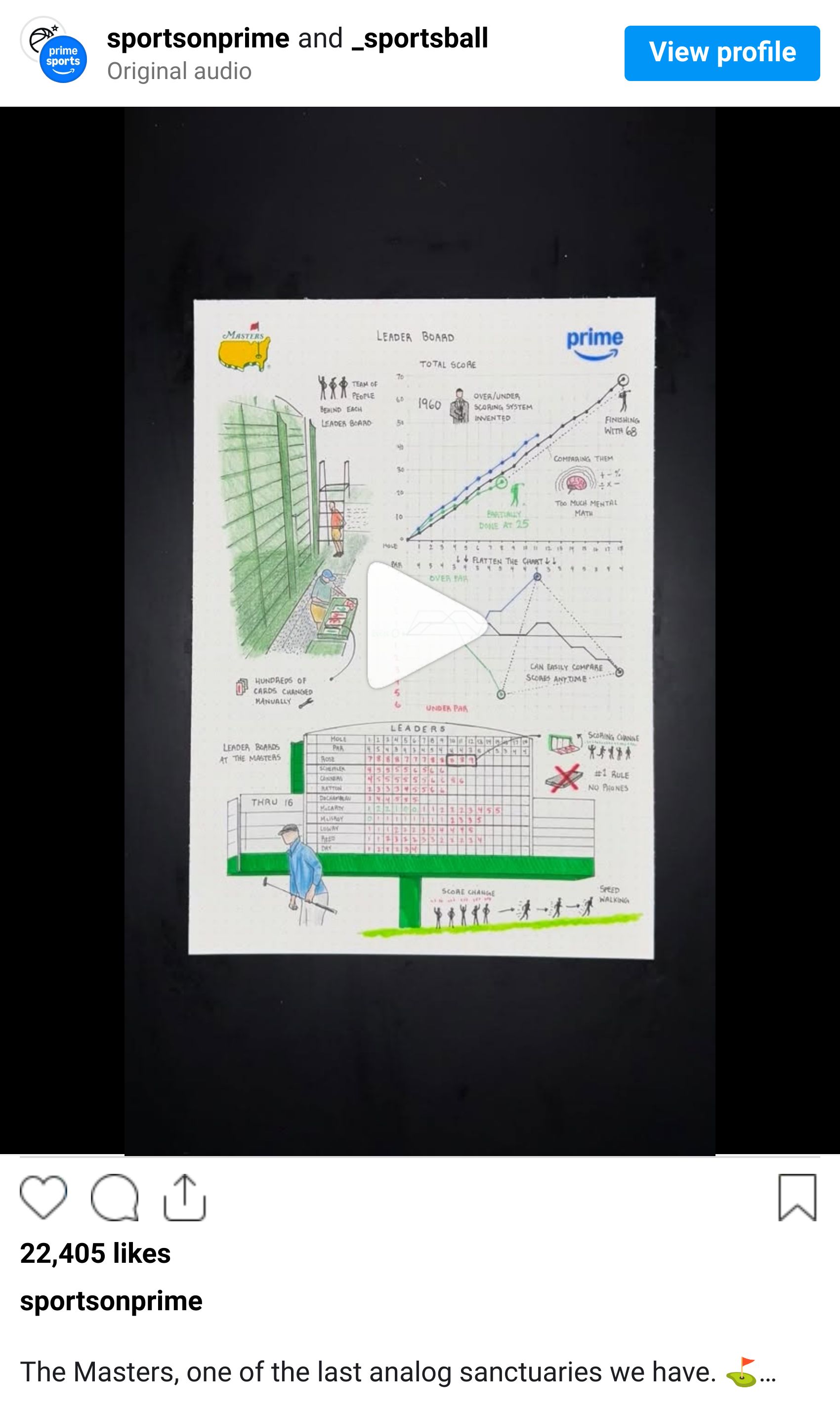
The Problem With Golf Scores
In the early days of golf, everything was tracked the simplest way possible.
Total strokes.
If you look at a round visually, it’s basically a line that just keeps going up. One shot at a time, one hole at a time, the number climbs.

The issue is that not everyone is at the same point in the round.
One player might be finishing at 68 strokes, while another just teed off and is sitting at 25. Both numbers are correct, but completely useless when you’re trying to compare them.
So unless you’re doing mental math all day, the leaderboard doesn’t really help.
The Fix That Changed Everything
In 1960, Augusta National co-founder Clifford Roberts and CBS producer Frank Chirkinian came up with a solution that quietly changed the sport.
Instead of showing total strokes, they anchored everything to par.
Every hole has a set value between 3 and 5, and now every player is measured against that same baseline. Even par sits at zero. Under par moves you up the board. Over par moves you down.
All of a sudden, the chart flattens out.

Now it doesn’t matter if someone’s on hole 3 or hole 18. You can look at the board and instantly understand where everyone stands.
It sounds simple, but it unlocked the entire viewing experience.
And it also unlocked the way I like to visualize golf today

Scores vs par in Round 1 at The Masters
Bringing It to Life on the Course
Which brings us back to the most famous leaderboard in golf.
At Augusta, these aren’t digital screens. There are no pixels, no refresh rates, nothing electric at all.
Each board is updated by a team of people standing behind it, manually flipping through hundreds of number tiles as scores come in. Think Fenway’s Green Monster, but for golf.

And here’s the part that makes it even better.
At Augusta, there are no phones allowed on the course.
So if you’re standing on hole 11 and something happens on 17, you’re not checking an app. You’re waiting. Then suddenly, a number changes on the board. And the entire crowd reacts.

Leader Boards places around August National Golf Club
Sometimes the roar you hear on the broadcast isn’t for a putt dropping. It’s for a scoreboard flipping from red 2 to red 3.
Information travels person to person across the course, almost like a relay race. Golf’s version of Paul Revere.
Why This One Was Fun
This project started as a way to highlight a broadcast partnership.
But it quickly became something else. It was really about how a single change in scoring turned golf from something you had to calculate into something you could actually follow.
And how that same system still shows up today in everything from TV graphics to the way I build charts for these videos.
It’s also a reminder that not every innovation in sports is about adding more technology.
Sometimes it’s about simplifying what’s already there with a little bit of math.
Project Sneak Peeks 🔜
🏎️ What to know about this year’s F1 season
🏀 Tanking
Hope everyone has a great week, and as always, feel free to respond with any feedback. We’re all ears.
More drawings soon.
— Riley & Claire
